2012
BioBag
Client
BioBag
Industry
Food and beverages

Packaging design
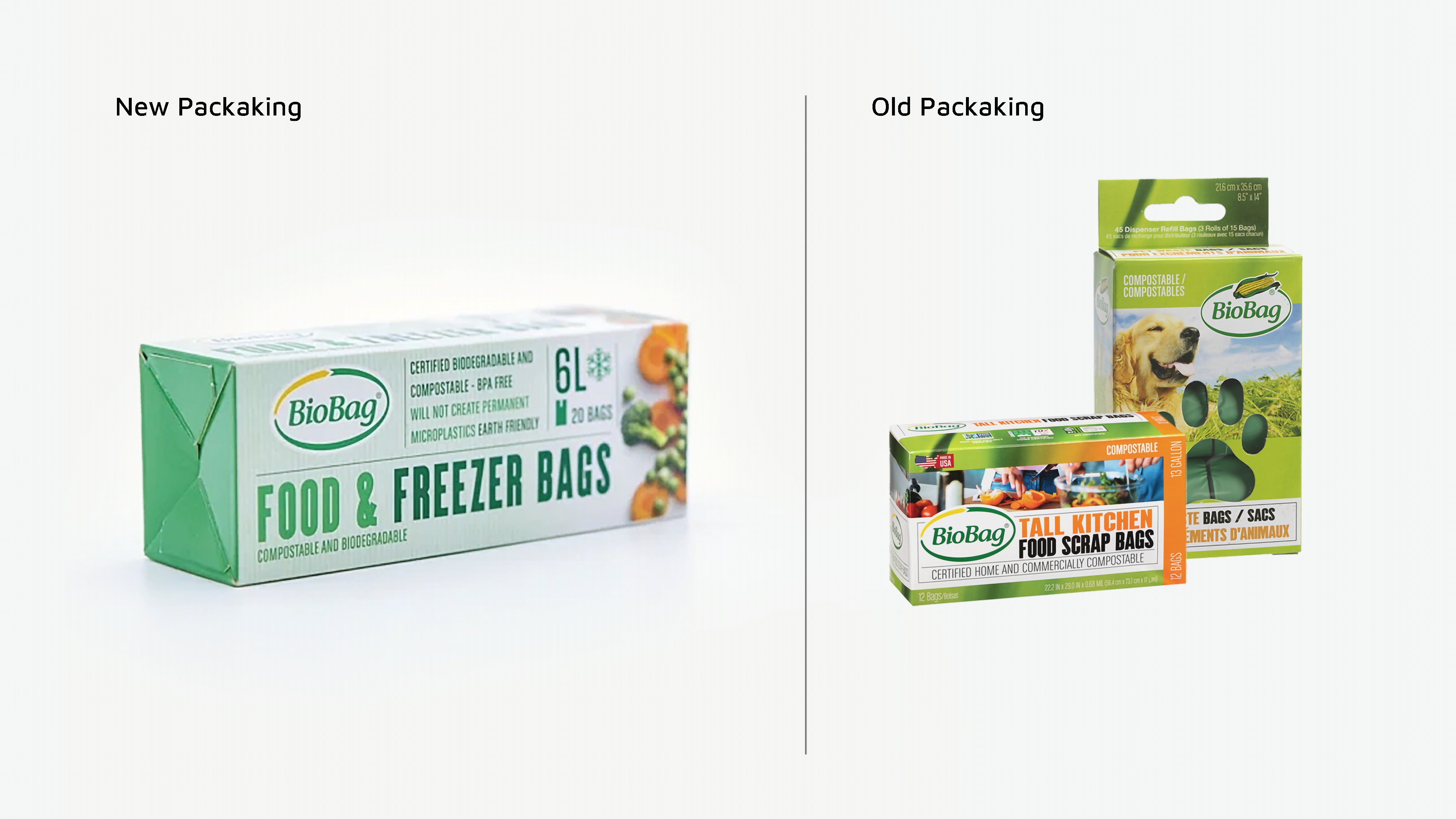
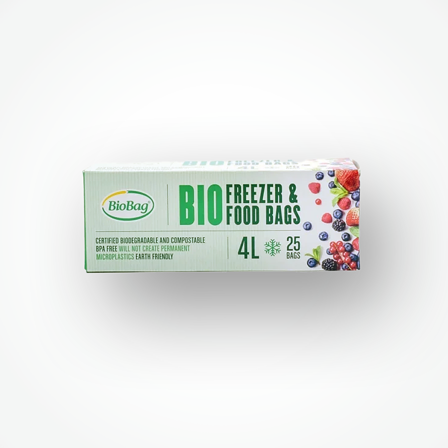
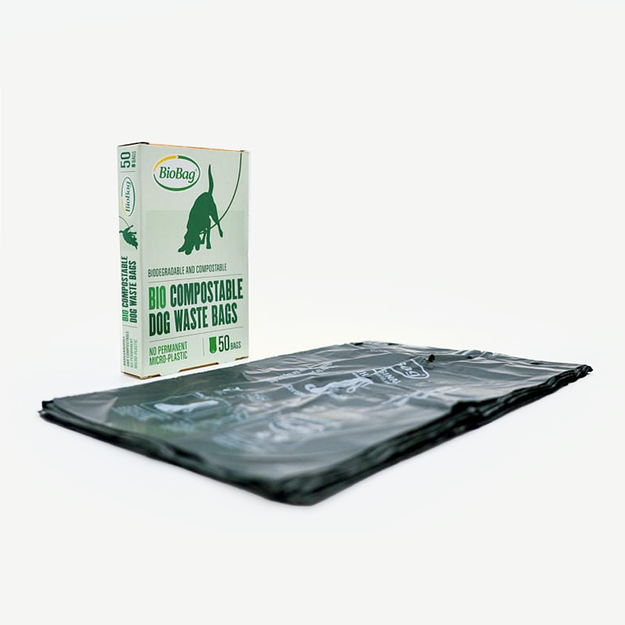
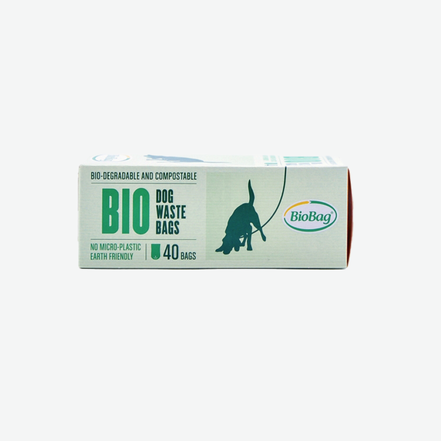
When redesigning, it’s often important to retain certain elements of the old design to create a visual link between the past and the new look. In the case of BioBag, the previous design was too cluttered and used overly bright colors that didn’t convey the idea of a biodegradable product. The redesign focused on creating a cleaner, more refined appearance while preserving the boxy layout and the distinctive tall, bold typography.