CASE // Bach
A visual identity, copy and a responsive website for a young Danish law firm
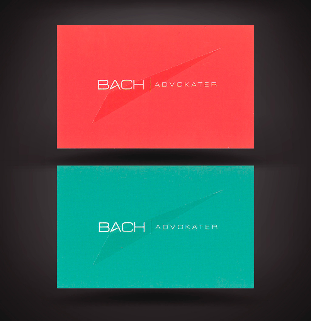
Law firms are usually conservative and have traditional tastes when it comes to their look and image. Blue, dark green, silver and black are the colours of choice for Danish law firms, except one. In order to reflect their newness in the market and attitudes,
Bach choose bright colours, an orange/red and turquoise. These two colours made the firm stand out from their colleagues.


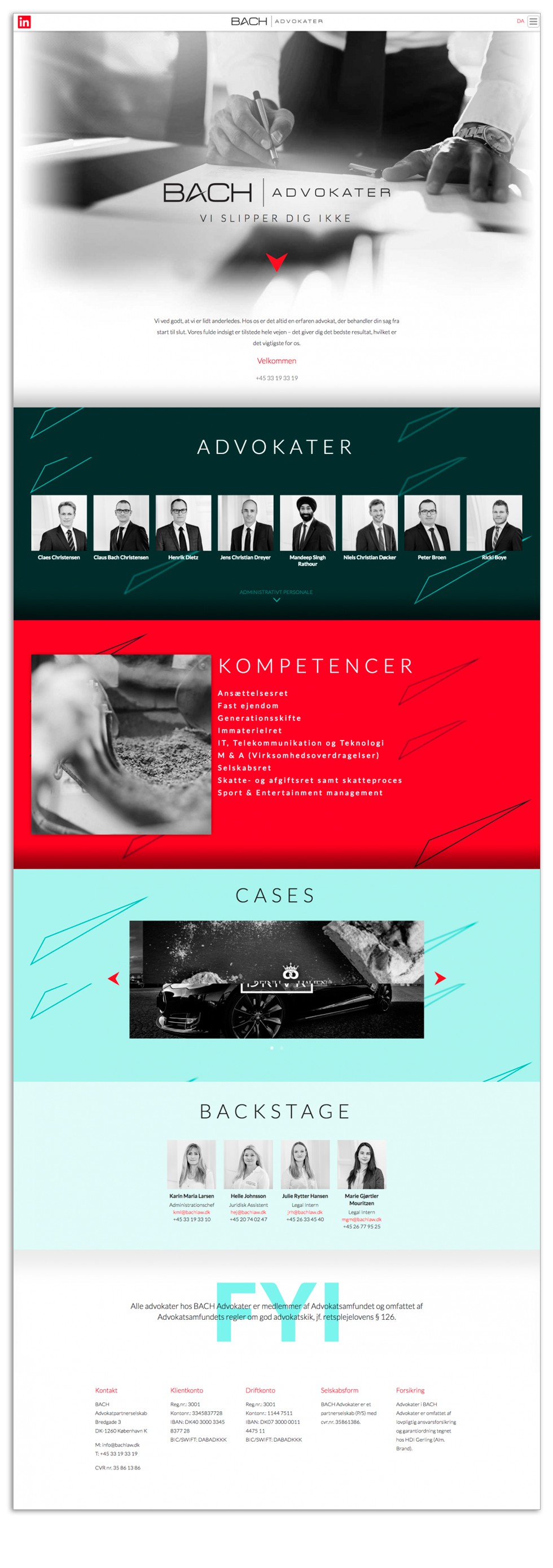
Black and white photography is used on the adaptive website to contrast with the bright colours.
If you need a lawyer or just want to browse the website


